Peter Elvidge
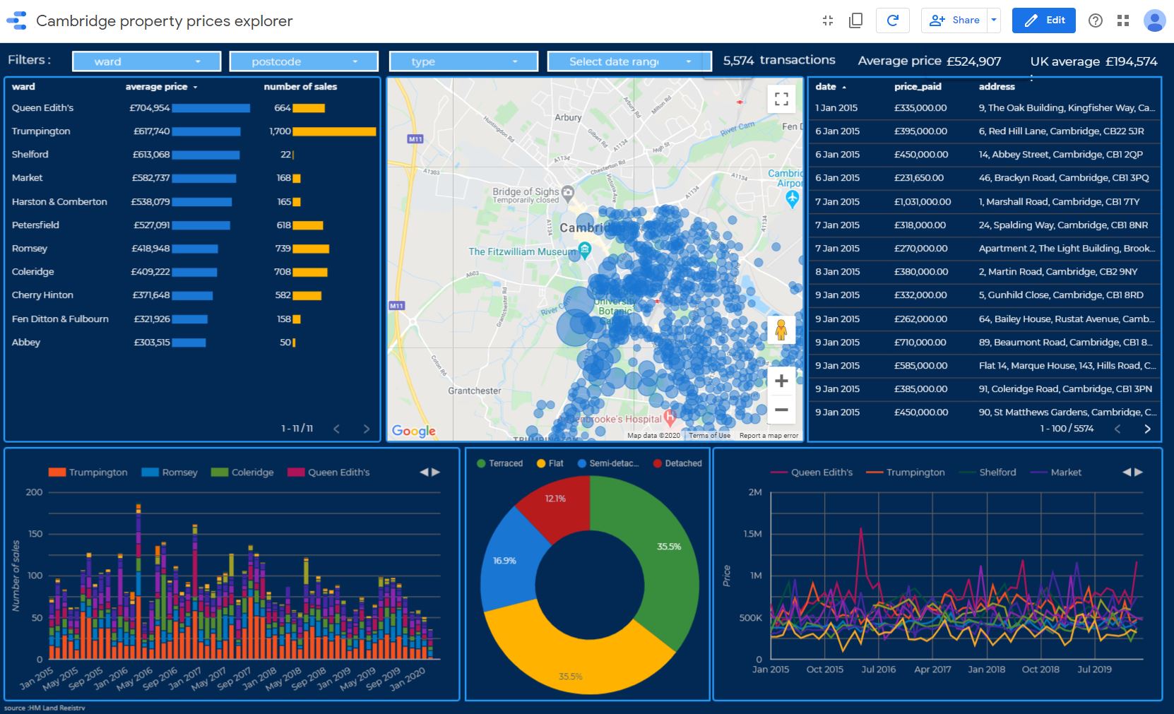
Property Prices Explorer
Which is the cheapest part of town to buy a house ? The street with the highest turnover ? How has the price of flats varied over the past three years in my post code ?
My property prices dashboard built using Google Data Studio was designed to answer just such questions. Drawn from public domain property sales data from HM Land Registry it aggregates five years worth of property transaction data to the level of ward and post code and features inbuilt sorting and filtering by property type, ward, post code and date range with synchronised mapping
To the left is a screenshot from my dashboard for Cambridge, UK. Try the full screen version in action here
Contact me if you would like an analysis done for your home town (available for UK towns only, currently; best viewed in Google Chrome)
Global mean temperatures since 1959 plotted against CO2
A scatter plot made with DataWrapper revealing the correlation between atmospheric carbon dioxide and global mean temperatures since 1959
Temperature data from Nasa GISTEMP combined land and ocean dataset presented as anomalies from 1951 - 1980 average baseline. Carbon dioxide data data in ppm (parts per million) from Mauna Loa CO2 Observatory
UK Climate data animation
Which is the nicest month weather wise ? I've long held that June and September are the nicest months in the UK. But does the evidence back that up ? I decided to take an objective look, the result, an animated bubble diagram built using Google Public Data Explorer that charts 100 years of UK temperature and rainfall data courtesy of the Met Office. The results indicate June to be slightly but consistently drier and warmer than September.
Enjoy
Glaucoma prescribing data from NHS England
An analysis of GP prescribing of leading glaucoma eye drops over the period June 2015 to May 2017 summarised to the level of clinical commissioning groups.
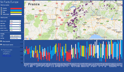
Ski Facts, since 2014
Ski Facts helps skiers and snowboarders choose a technically suitable European ski resort.
Eschewing the traditional glossy brochure style, Ski Facts takes a data visualisation approach incorporating public domain data on the
technical fundamentals of each major resort such as altitude and number and difficulty of runs into a combined mapping and charting tool to help people identify
which resort best suits their ability level.
Developed using D3 javascript data visualisation library for charting and Carto for mapping.
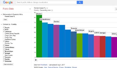
Deforestation in Equatorial Africa 2017
Animated bar chart using Google Public Data Explorer illustrating land percentage covered by forest in all the countries of equatorial Africa from 1990 to 2015.

Hull based Nepal Trekking has been operating trekking services in Nepal for over 25 years. I have had a long term enduring business relationship with this excellent company, having designed their original website in 2001 and have maintained it for them ever since.
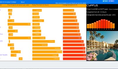
Worldwide All-Inclusive Holidays
Conceived to simplify the process of choosing your next holiday by presenting a high level data visualisation of the range of Thomas Cook All Inclusives.
This consists of a side by side bar chart style comparison of the fundamental factors involved - weather, price range and flying time (from London) at country level..
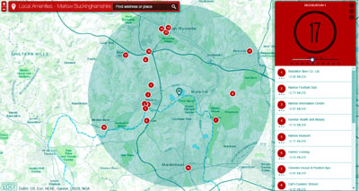
A web mapping application serving local information for Marlow, Buckinghamshire.
Built on ESRI's cloud based mapping platform, this application locates banks, pubs, churches, restaurants etc within a variable radius of Marlow town centre.

An interactive global data visualisation of various United Nations indicators such as life expectancy, infant mortality, education or income projected onto a scrollable interactive globe. Currently offline and awaiting new globe rendering software since Google withdrew the Google Earth API plugin in Jan 2017.
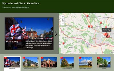
A web mapping application serving as a photographic guide for tourists and visitors to High Wycombe, Buckinghamshire. Also available as an Android smartphone app on Google Play here
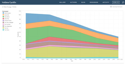
As my analysis shows, readership of newspapers has been in decline across the board. This became most notable around 1981.
Built on the TableauPublic platform.